Case Study
NIDO
A warmer, more cohesive identity for a platform that connects people with therapists.
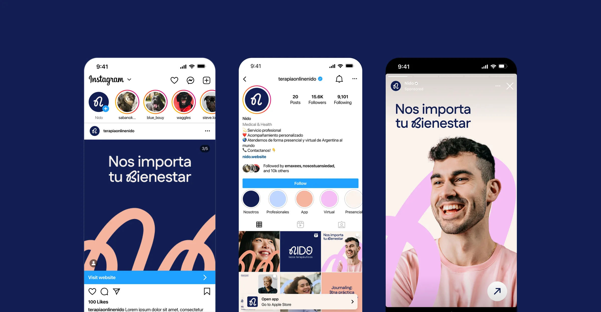
NIDO is a platform that connects people with qualified therapists online. The app already existed, but it lacked a cohesive identity and a clear personality. The product team brought me in to redesign the brand, build a new website and refine the app’s UX/UI.
The Challenge
Therapy runs on trust. People needed to feel safe choosing a professional online, and therapists needed a platform that made them look credible. The brand had to speak to both.
The Process
Building on the team’s user research and a benchmark of the category, I explored two brand directions and presented them to the stakeholders.
The Logo
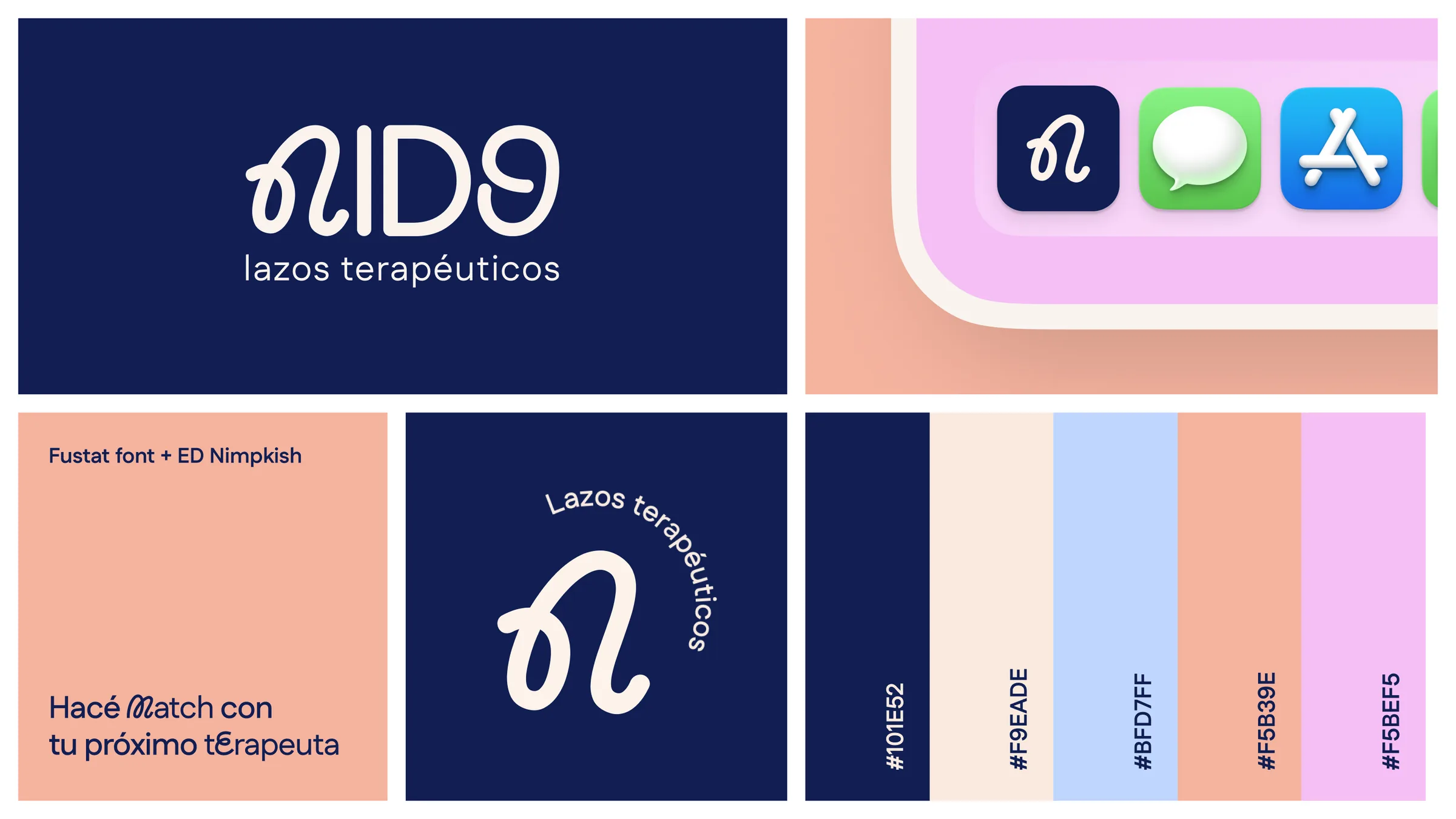
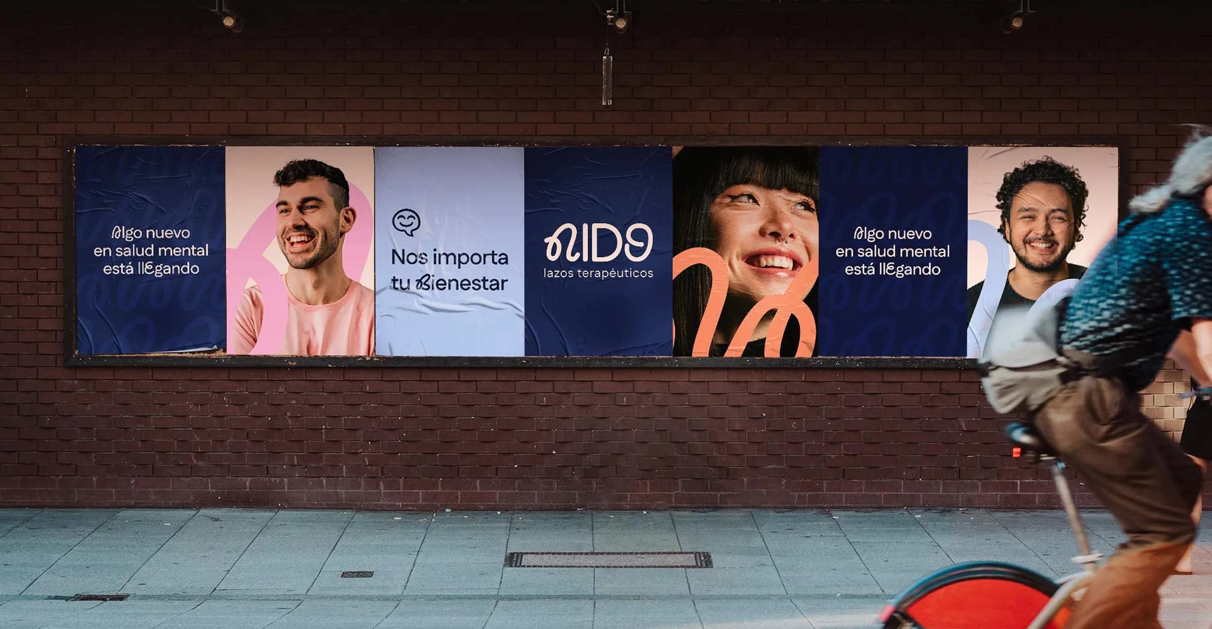
The N is drawn as a single continuous loop, a bond tied between two people. That stroke became the system’s signature, used as a line, a pattern and a texture across every touchpoint.
The Concept
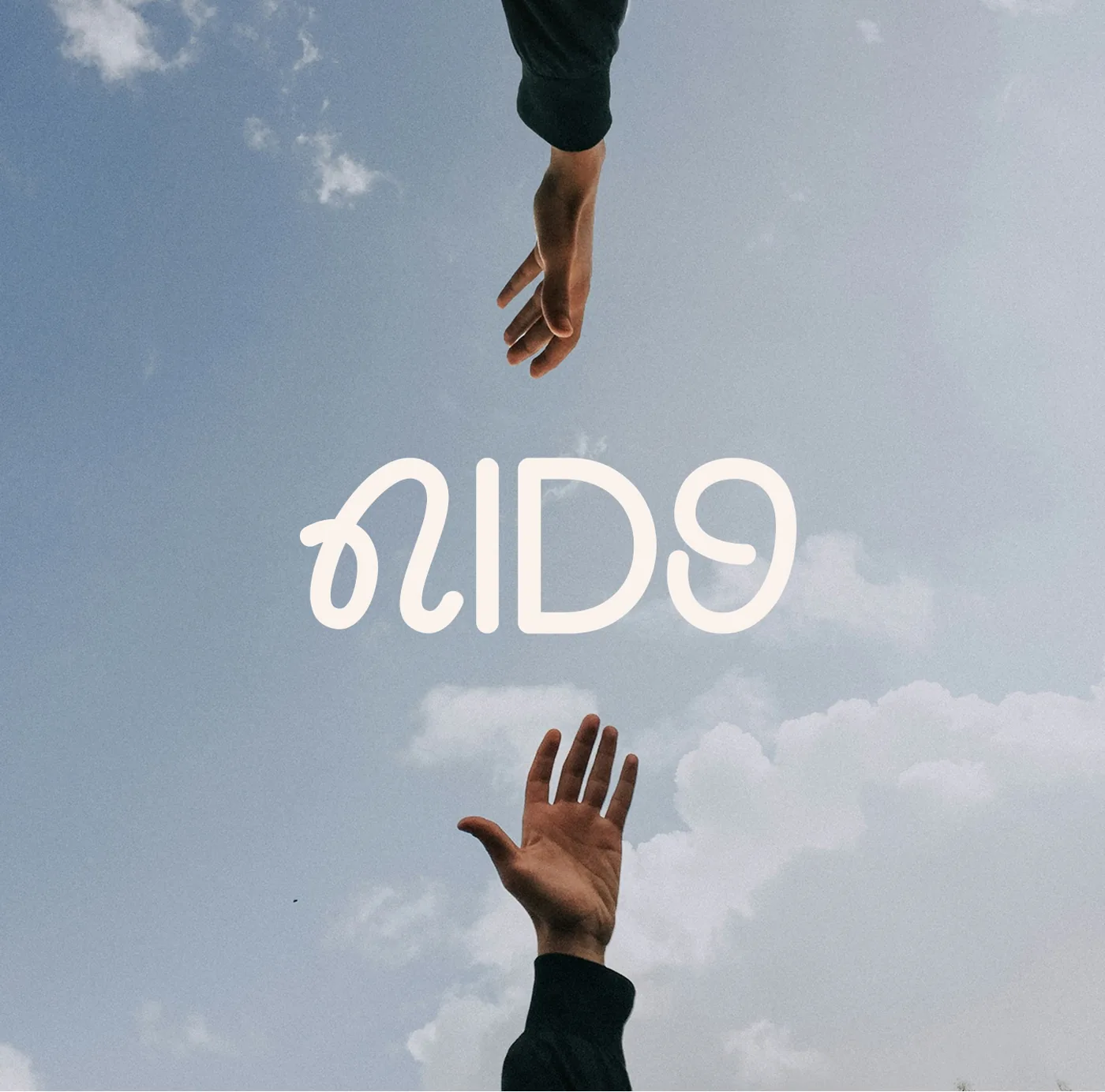
NIDO’s motto, “lazos terapéuticos” (therapeutic bonds), became the core of the identity: a brand built around the bond between patient and therapist.
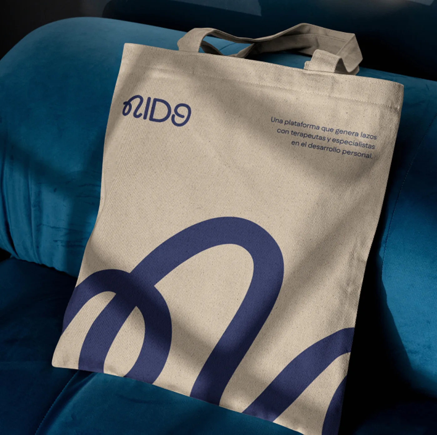
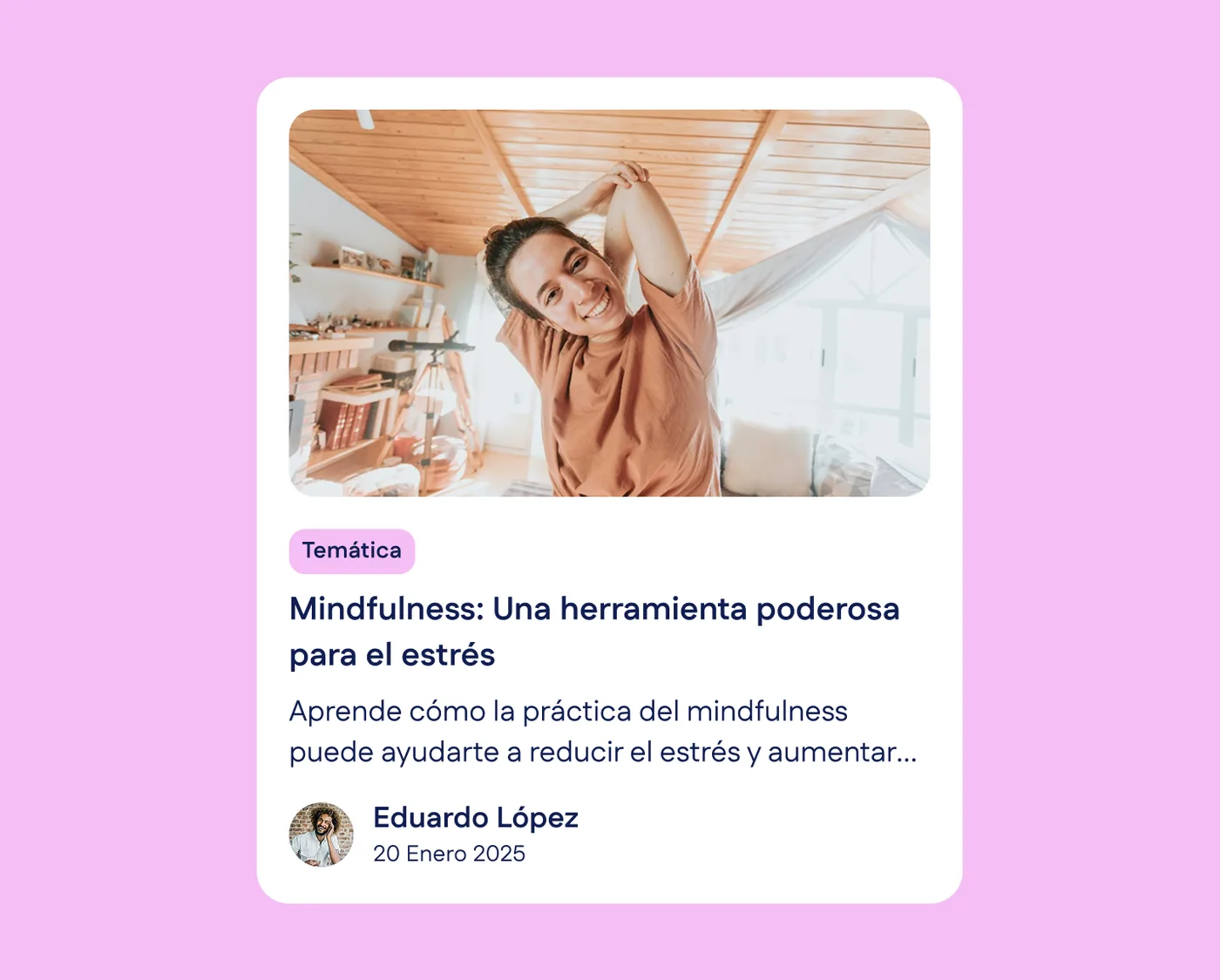
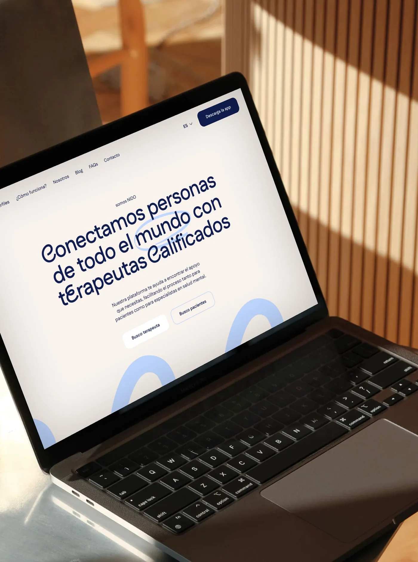
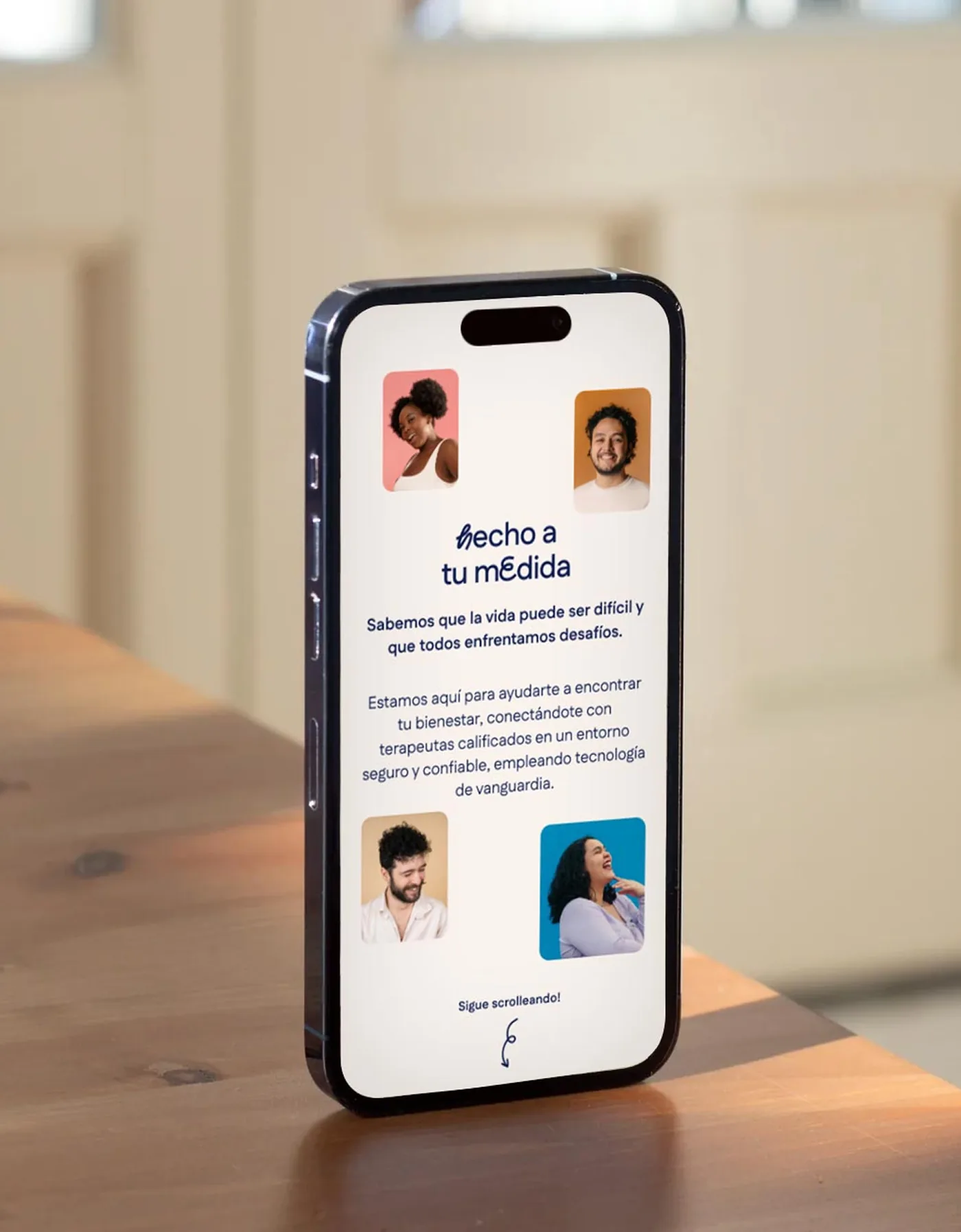

One loop, one idea: a brand built around the bond between people.