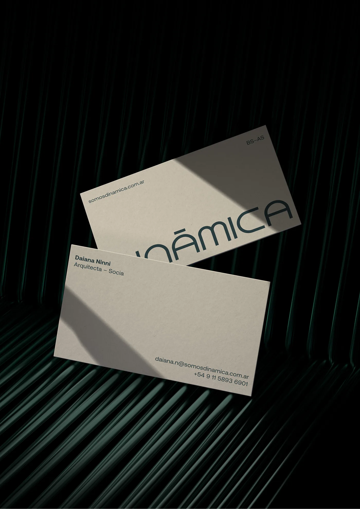
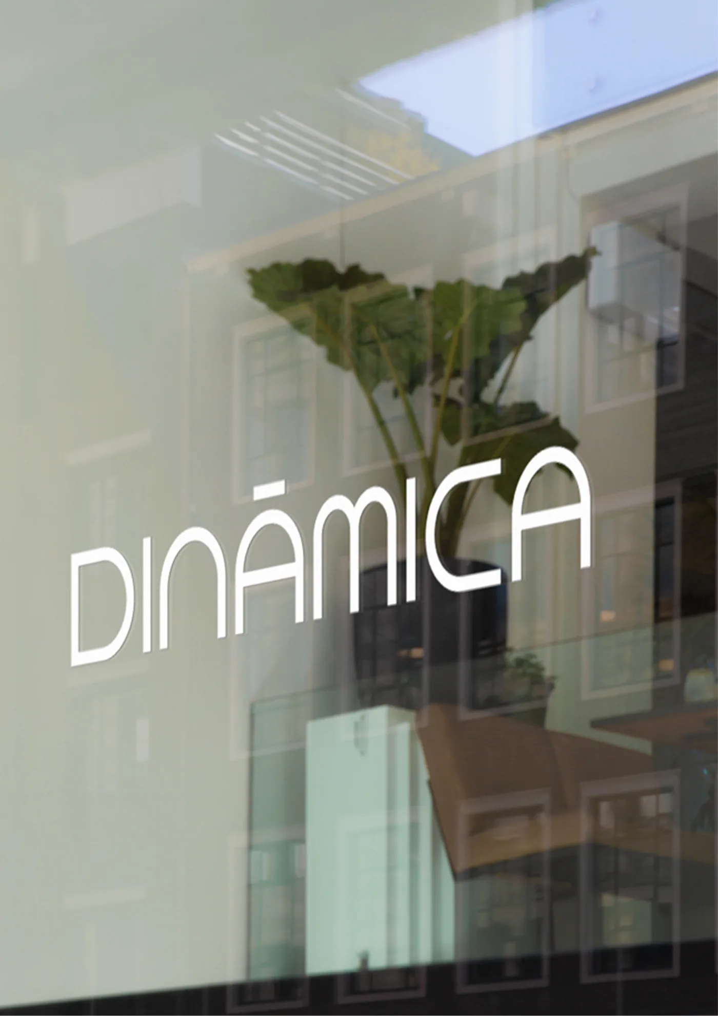
Case Study
Dinámica Construcciones
A complete rebrand for a young construction company that never stands still.
Dinámica is a Buenos Aires construction company founded in 2020 by three partners under 40. In 2025 they asked me to redesign their identity from the ground up: a brand that could feel as solid as the spaces they build, and as restless as the people behind them.
The Challenge
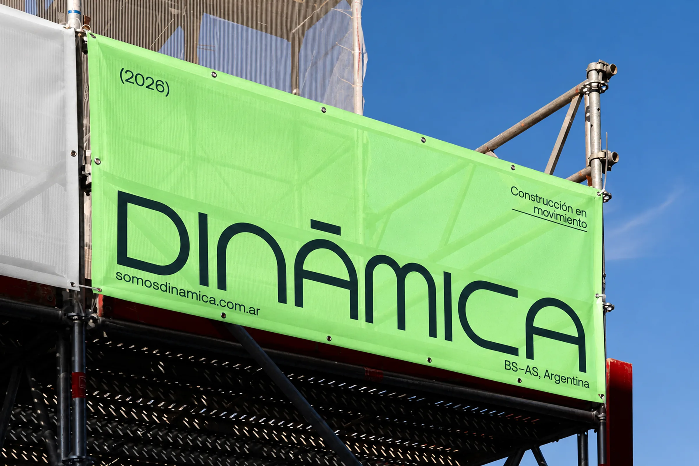
Dinámica had a name and a motto, “Construcción en movimiento”, but no identity to match. The brand had to feel reliable without losing the team’s energy.
The Concept
Stability in motion. I built the identity around the tension between structure and movement: solid, geometric forms that never feel static.
The Logo
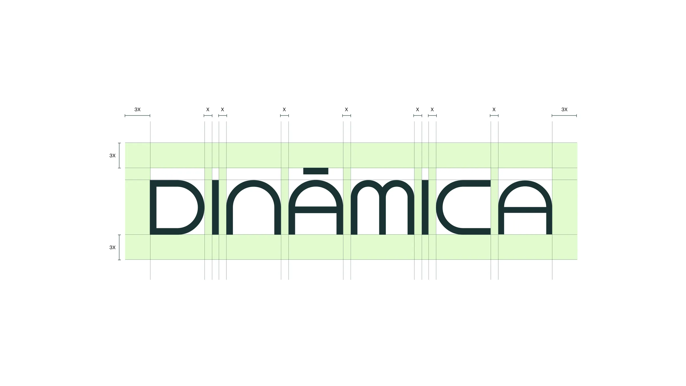
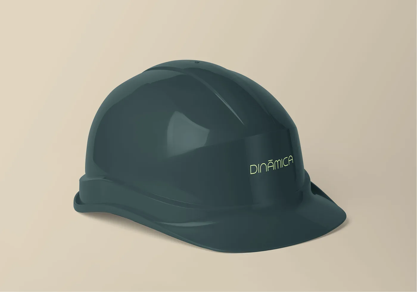
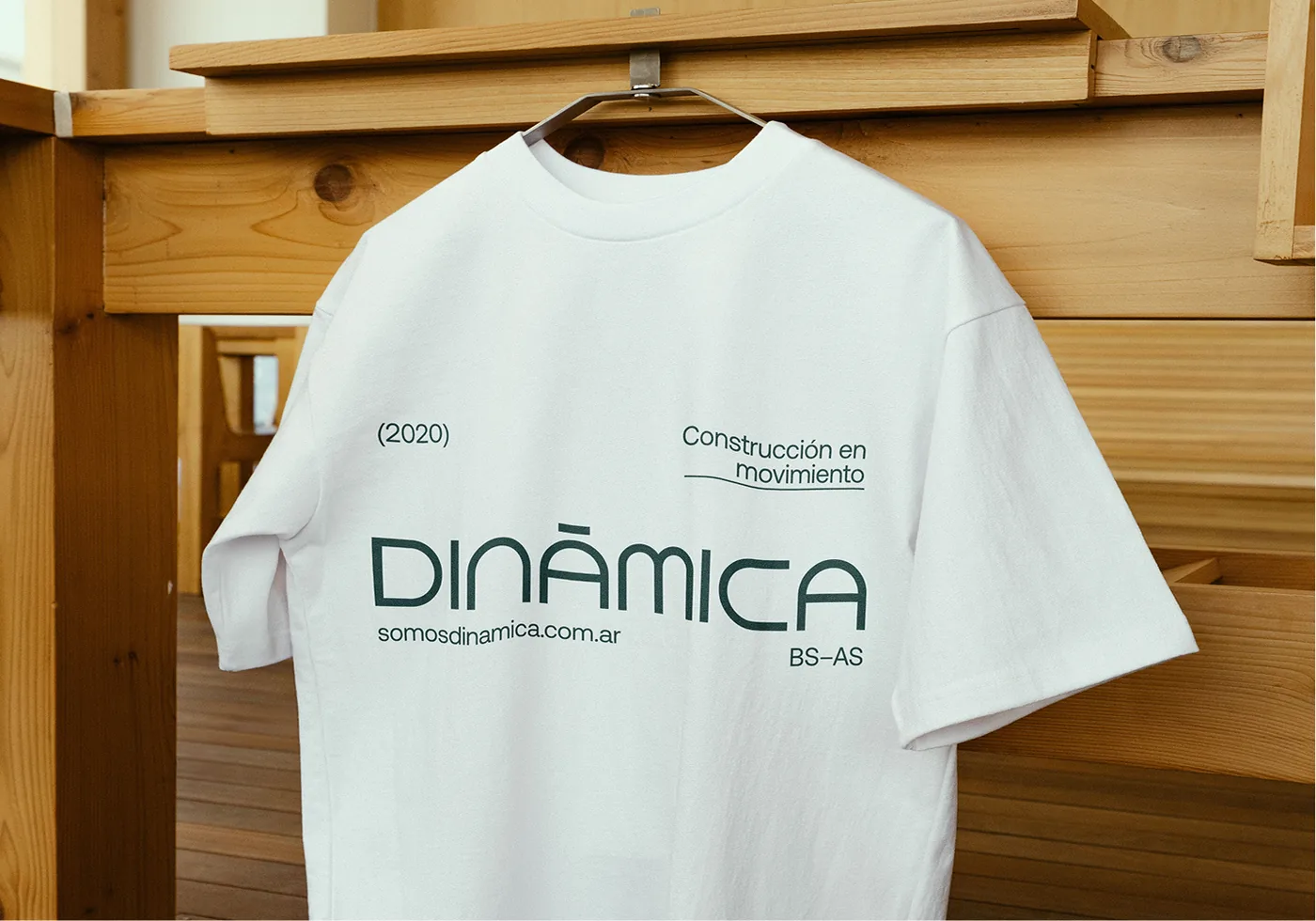
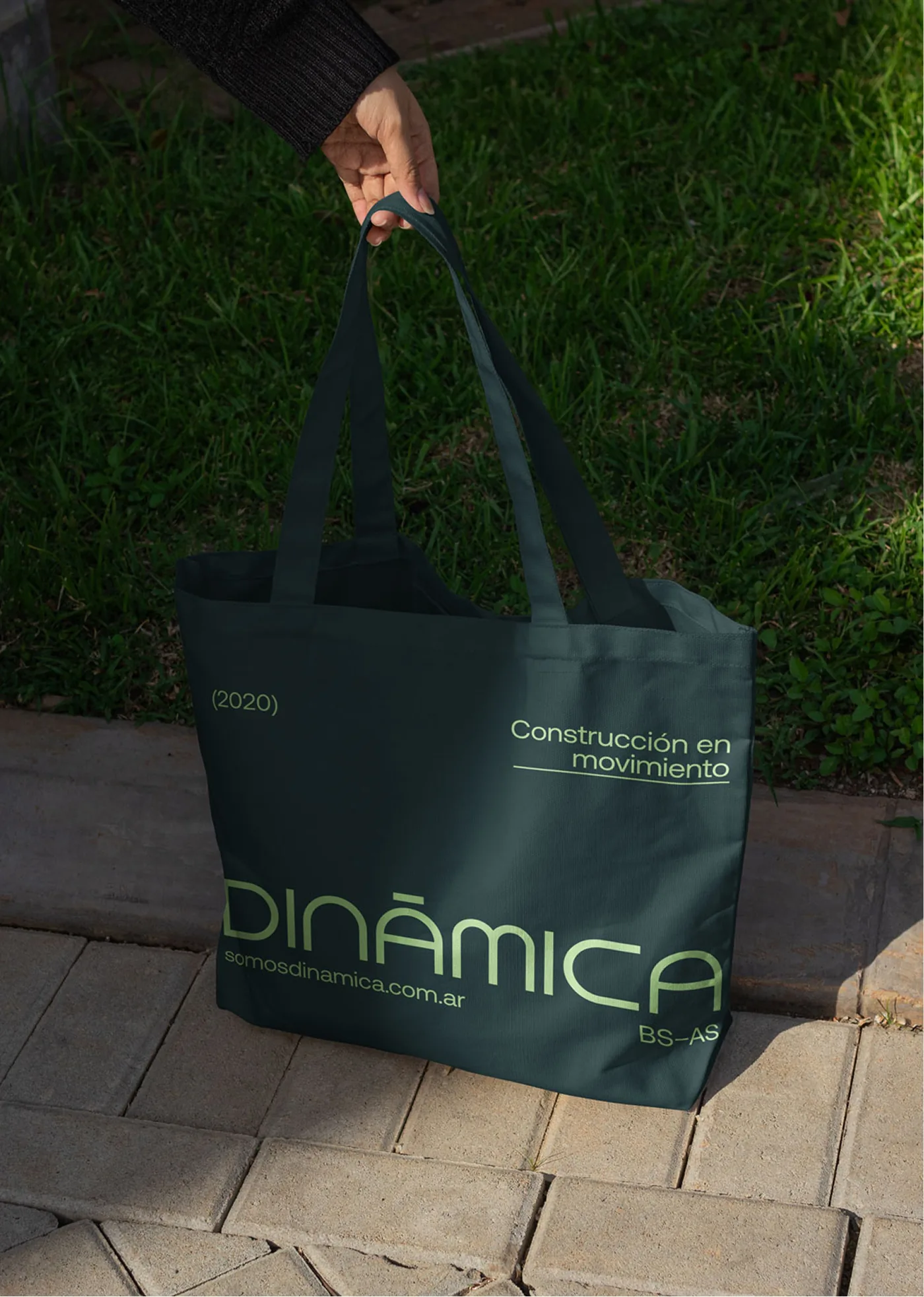
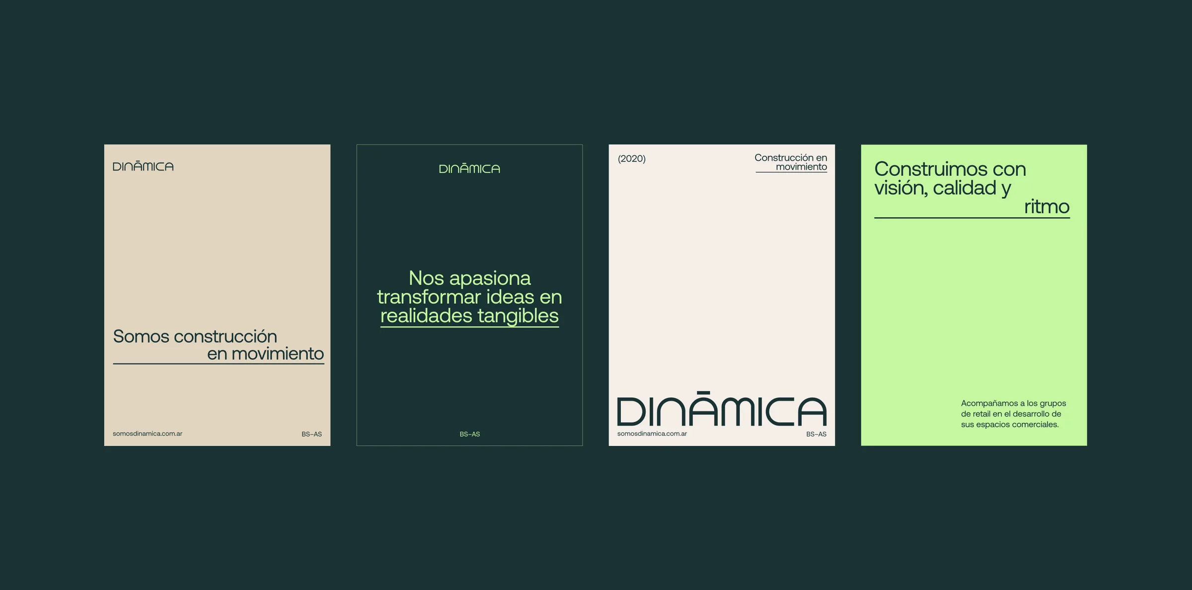
A custom wordmark built from pure geometry, like a blueprint. The accent on the Á works as a roof over the structure, paired with Aeonik, a contemporary grotesk, for all communication.
The Colors
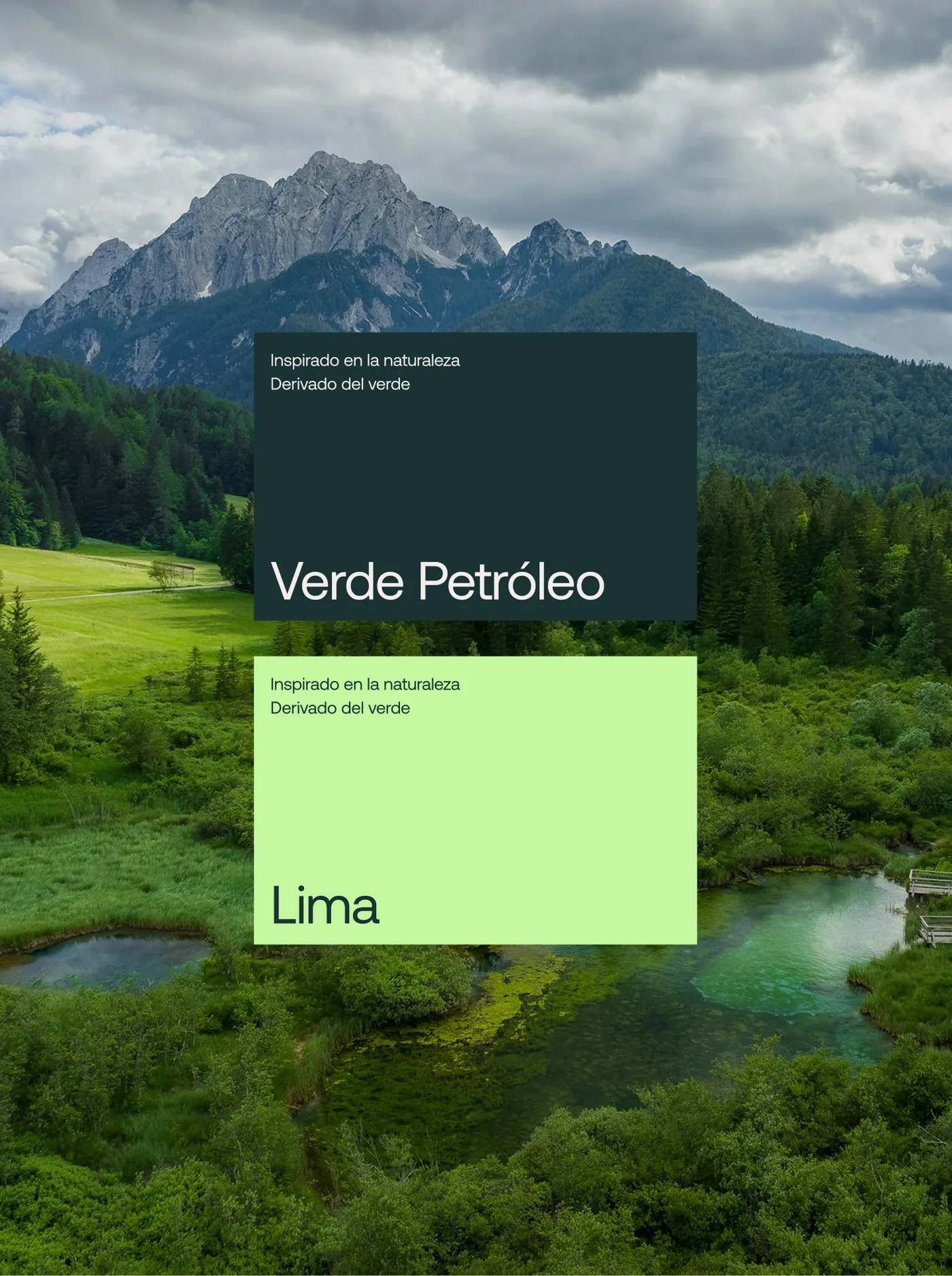
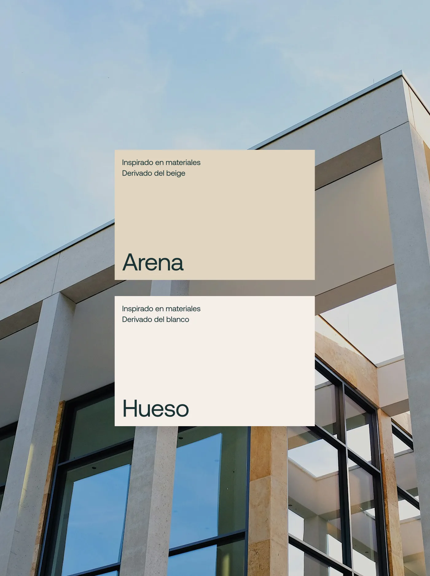
Their previous moss green, pushed into a vivid lime that matches their energy. Petrol green adds contrast, while sand and bone bring in the materials of a construction site.
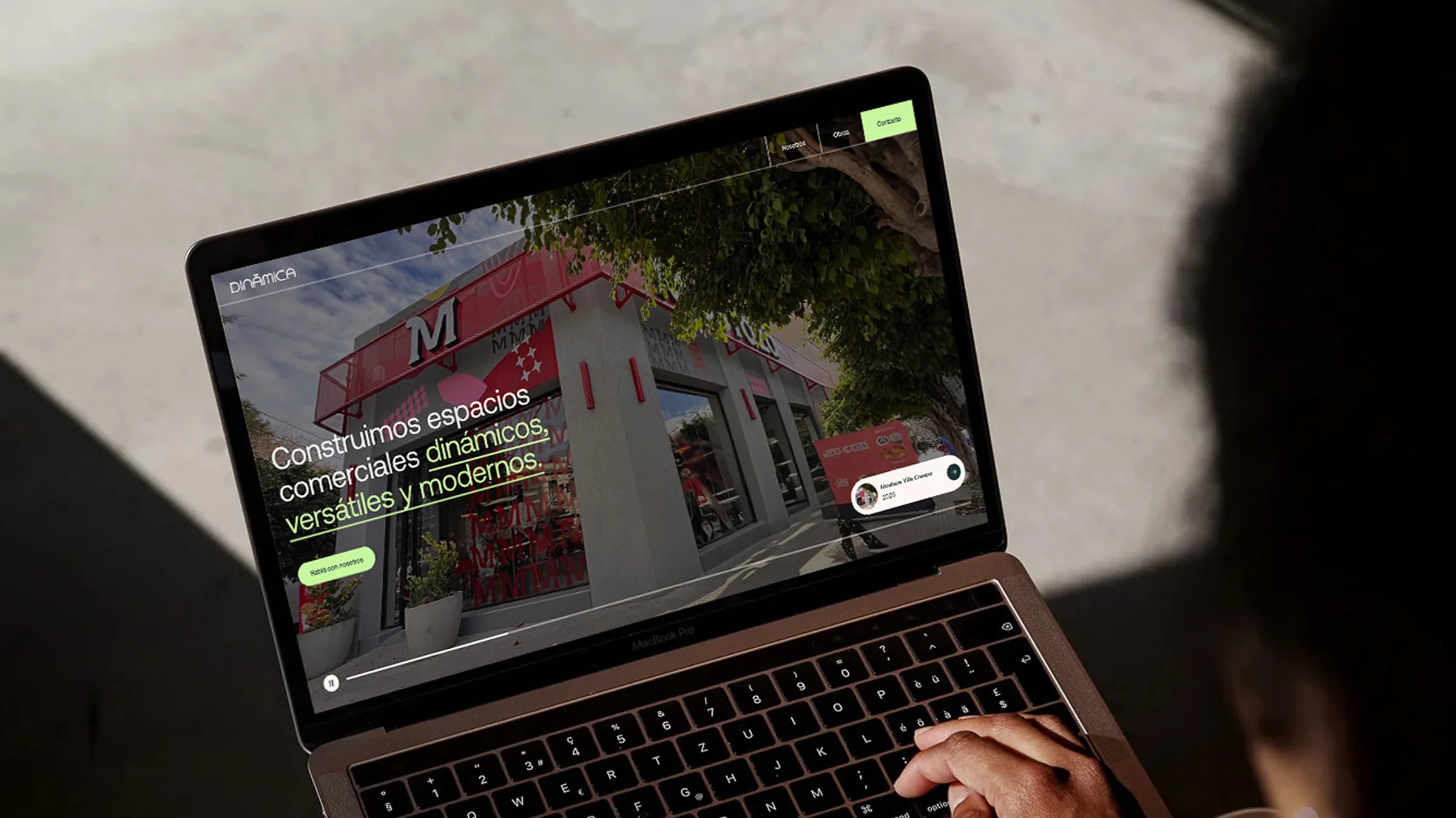
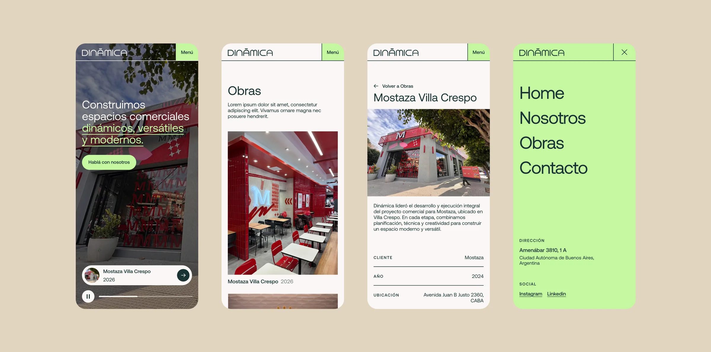
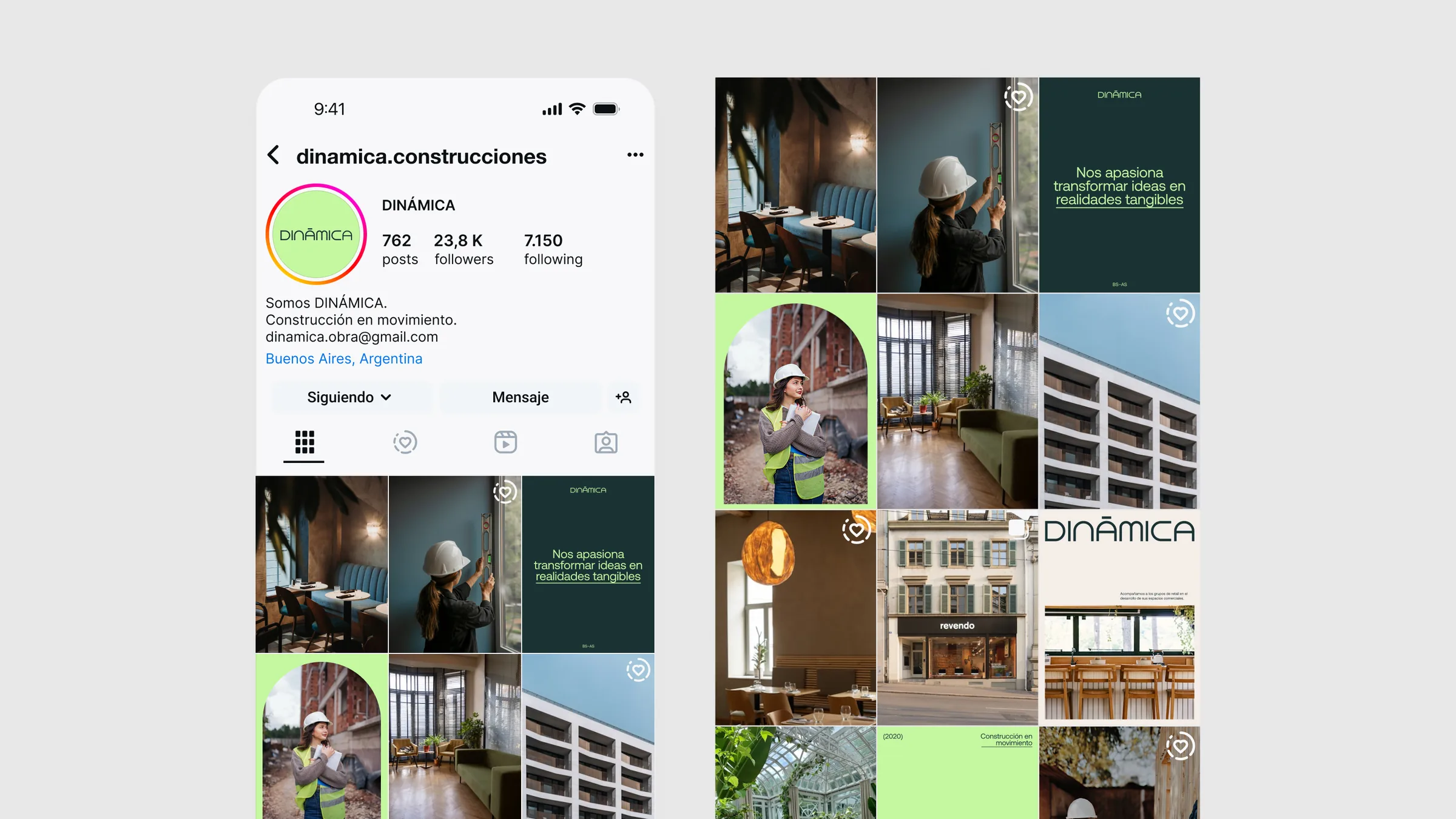
A brand that works the way they do: solid, fast and always on the move.